If you’ve ever spent an afternoon trying to determine whether a manager’s direct reports are dashed or solid lines, you’re intimately familiar with the struggle of creating and maintaining an effective organizational (org) chart.
The good news is that you don't have to be a SmartArt guru to create an org chart that visually represents your company's hierarchy. But you’ll want to follow a few essential best practices so your entire team understands and appreciates this document.
What’s an organizational chart?
An org chart is a document that outlines a company’s hierarchical structure using stacked boxes and lines. Usually, it looks like a pyramid, but this varies depending on the chart type.
Typically, C-suite leaders are at the top, with their direct reports sitting below them. This continues until the chart accounts for every employee.
Visualizing a company’s structure and roles helps cross-functional teams understand communication cadences and relationships at a glance. Looking at a diagram to determine employee reporting roles is quicker than pinging several people in Slack. And you can use the charting process to plan a new business or find hiring opportunities.
Your org chart might be basic, simply diagramming internal hierarchies, or complex, offering information like employee contact details and essential duties.
When creating this chart, put yourself in the shoes of a new hire. Consider the information they might want at a glance, whether that’s just names and direct reports or details that help them de-escalate issues and go to the right people to ask questions.
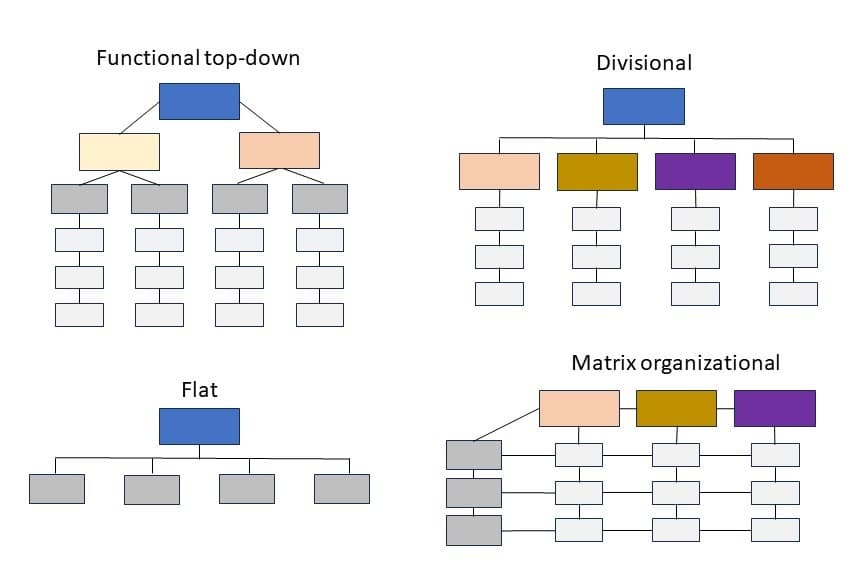
4 types of organizational charts
There are four key types of organizational charts, and you can create as many or as few as you like depending on your needs:
A functional top-down chart is the most common. It's a strict hierarchy, with the CEO or business owner at the top followed by other executive leaders and their direct reports. The chart then branches off into different departments and teams.
A divisional chart is a high-level version of the classic top-down org chart that represents each department separately, not illustrating shared resources. This chart type is beneficial for large and widely distributed businesses.
A flat chart is great for small businesses or startups without middle managers. This document outlines the boss or founder and everyone else underneath — that’s it.
A matrix organizational chart is perfect if your company has complex reporting roles, as you'll use this outline to represent all possible reporting scenarios.
How to make an org chart: 4 steps
Use this outline as an org chart template your team can follow to create useful documents as needed.
1. Determine the chart type
Before gathering data, consider who this chart is for and why. For external stakeholders, hiring managers, or investors, perhaps you want a functional top-down diagram that briefly showcases staff. And if one team is having communication issues, you might create a matrix organizational chart to clarify reporting cadences.
2. Gather data
Without data, your org chart is just a bunch of empty squares and lines. Connect with your HR department or relevant managers to gather employee reporting structures and existing divisional matrices. You could also collect employee headshots if adding images to your chart.
3. Choose a charting software
While you could break out the archaic design tools and draw an org chart, you’ll probably want to use software to make it much more manageable.
Here are some of the best software for org charts:
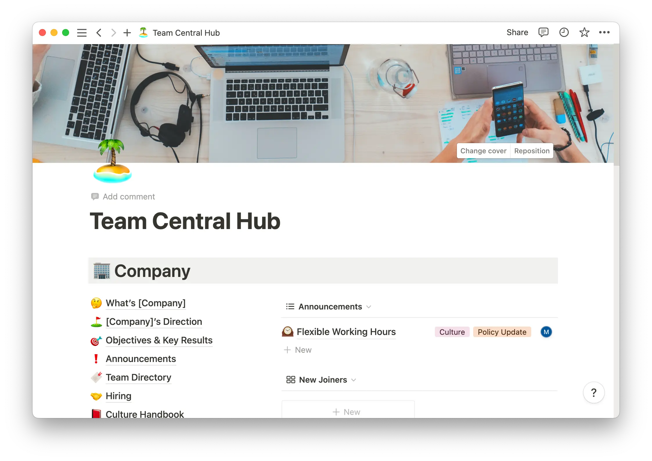
Notion offers templates and how-to guides for making flowcharts that accurately and dynamically represent your team. Store these documents in a connected team workspace that everyone can access.
Microsoft SmartArt lets you quickly design colorful and creative charts within the familiar confines of Microsoft Word.
LucidChart is an online tool that quickly creates flowcharts and diagrams.
Microsoft PowerPoint offers drag-and-drop functionality and automatic arrow connections to org chart boxes.
Microsoft Excel lets you create spreadsheet-style charts your team can easily access and update.
4. Leave space for updates
A manager might promote an employee, and a new hire could start next week. Change happens, so ensure you’ve created a flexible and dynamic chart, updating it often so it accurately represents the company.
Tips for creating and using your org chart
No matter the software you use, your chart is only as effective as you make it. Create a thoughtful and useful document by following these tips.
Make it detailed
Org charts should at least include names and roles, but to make this document more valuable, consider adding contact information and key job responsibilities. You might make this information available via a toggle-down feature so stakeholders can quickly note the general structure while more involved team members can access more info.
Keep your designs consistent
A visually confusing org chart isn’t very handy. Color-code your chart for certain roles, like making C-suite execs red and senior managers yellow. Follow this coding across all org charts, and provide a key on each so employees know how to use these documents.
Create a change management policy
Because these charts are bound to change, define a change management policy before sharing your documents. This will include:
Who the chart is for and why
Designated chart-management individuals
Instances where the chart must be changed
Who to contact if an un-designated employee wants to make a change
Dependent charts that need updating if other charts change
Share the chart broadly
Keeping in mind who the chart is for and why, share this document with everyone relevant. You might send a company-wide email to share a matrix organizational chart or add a divisional chart to employee handbooks. You should also house these documents somewhere central, like a Notion workspace or Google Docs folder.
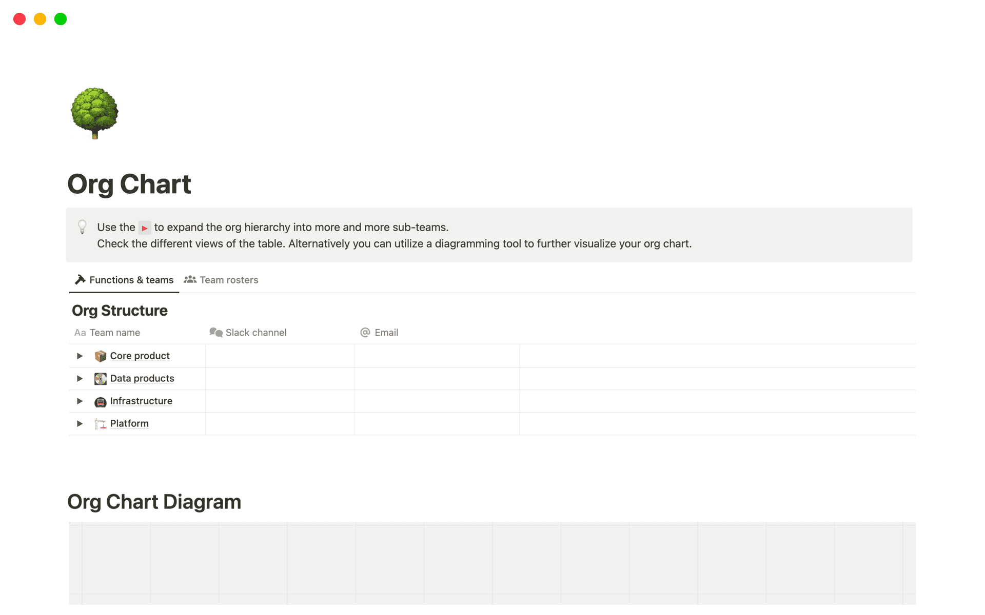
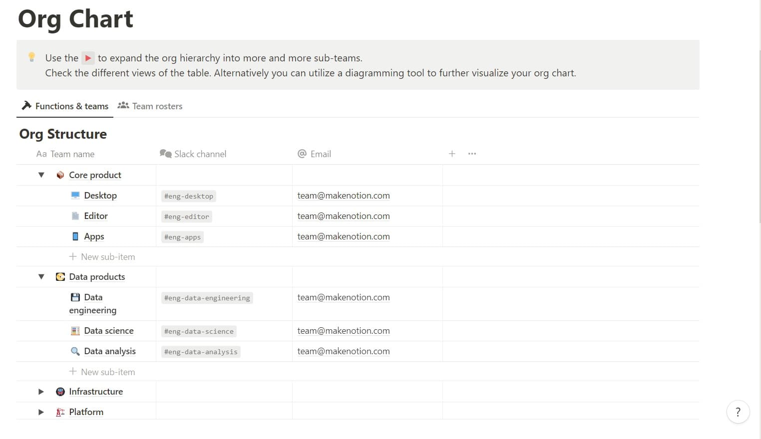
A Notion organizational chart example
Notion's organizational chart template helps you quickly outline team structures and add details like communication channels. While not a classic org chart visual, this table efficiently organizes your data. Then you can use the diagramming tool linked in the template to fully visualize your hierarchy.
Make a custom org chart in Notion
Creating an org chart helps you better understand your team. And promoting this organizational transparency reduces miscommunications and misunderstandings.
Before completing Notion’s org chart template, start with the people directory and board member outlines to gather team data. Then fill out the above template or follow our how-to to create a custom org chart from scratch.